
So summer is rolling right along (how is it already mid-July) and I have been pretty quiet of late. No real reason other then we have been busy. I am working on learning a few things this summer and doing a few different challenges and that has been keeping me
 busy. A little watercoloring here, some brush lettering there, and lots and lots of coloring. It really has been fun and more importantly, I feel like I am developing some new skills (or at least that is what I’ve been telling myself).
I also seemed to develope  an inner ear infection like a wee child, which has caused quite a bit of vertigo. Vertigo sucks…there is no other way to it. I’m on the mend, but for those who are continuously inflicted with this awful condition, my hearts goes out to you. Dizzy is no fun. Dizzy and off balance for hours, well frankly there is no
  words for it.
What hasn’t been happening much lately is my card making (or at least not as much as normal). It isn’t a lack of love towards the challenges I enjoy so much, it is just that time is precious and I’ve been having a ball playing with my children while they are home. (And yes, we too have fallen victim to the Pokemon Go while walking the dog. It is amazing how long and far the kids will walk when they are chasing a digital critter.)
Any who, the challenges…
 Up first today we have a color challenge that I either nailed, or totally biffed. I just haven’t figured out which it is yet. The designers over at The Paper Players have challenged us to play with the colors of mint macaron, island indigo, and sweet sugarplum.

I really was in the mood to make a mess, so I pulled out a great little stamp from Penny Black and white embossed it onto a piece of watercolor card stock. Then, with a three shades of distress stain, (cracked pistachio, brocken china and victorian velvet) I went about making my mess. Then using some Perfect Pearl spray (which is retiring and I’m so sad and stocking up on my favorites before it is gone), I painted my images in with the mica spray so she would have all kinds of shimmer and stand out against the mess. I stamped out a Dylusion sentiment and added a bunch of sequins to add to the chaos of the card. Like I said…I either nailed it, or really failed. I just can’t figure out which.
 The sleuths of design over at Can You Case It, passed out the challenge of a sketch this week. It was a really simple sketch design, and yet the possibilites of it are quite endless.
I went with a bit of a layered effect, layering not only my cards stock, but my words as well. I pulled out a sweet little stamp pack from
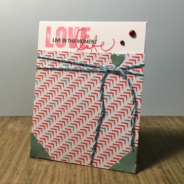
Technique Tuesday, and layered the three different sentiments with three different shades of Archival Ink. Then I snagged a piece of printed cards stock and trimmed it up to fit under the sentiment (knowing that I would have to cut off a little of the ‘f’ in life). I didn’t want this card to look like a v-day card so, I really tired to pull out the teal in the card stock by die cutting (with a CCDesigns die) the hearts and the corner pieces in some tealish cardstock. I added a bit of bakers twine and adhered it to the card with some dimensional tape so that the layers would really stand out. Then hoping to make the teal card stock pop even more, I added glossy accents over it. You can’t see it in the photo but they are so shinny, and I love it. Finally I added a couple of red dew drops or what ever they are called (seriously, what do we call these things). The only reason I added red drops was because I just didn’t have any tealish drops. In the end I feel it ended up too valentine(ish), but I like the card regardless.
 Changing gears a bit, we will celebrate a little Christmas in July with the holiday elves of design over at 52 Christmas Card Throwdown. This week we have been given the challenge for designing a christmas card in shades of blue, plus white and

silver.
I pulled out a sheet of heavy card stock and sprayed it a bit with some Perfect Pearl spray in both Forever Blue and Blue Raspberry. (I really do love perfect pearls, and if you don’t this card isn’t for you.) I pulled out a Christmas sentiment pack (I don’t know who made it, it is so old) and with perfect medium stamped it out. I rubbed in some Blue Patina perfect pearls powder into it, leaving it that lovely shade of silver blue. I then stamped out my snowman from a Stampendous stamp pack in some Archival Cobalt ink, and using my clear ranger embossing pen, colored in sections of his winter wear so I could rub in perfect pearl powder again, this time in Blue Raspberry, Blue Patina, and Pewter. Finally, using some snowflakes from the Stampendous pack, I stamped them in some cornflower blue Archival Ink. I trimmed down the card and added a bit of blue printed paper behind it, and called the card done. It is so shinny and pretty, and I wish the picture showed it, but alas, it only shows the great color on the page.
 Finally today we have another sketch challenge, this time from the gals over at Sunday Stamps. This sketch is pretty detailed and I wanted to stay true to the tag detailed, so I knew from the beginning I was going to start with a tag.
Now for what to do design wise, I knew I needed a card for my mom (and daughter, and son, and nephew too) to hopefully cheer them up. In past twenty-four hours, my teenage nephew lost one of his favorite fish (he has a really cool tank), my daughter loss her week old beta (a birthday gift), my son’s evil (I mean agressive)

fish killed another fish (again) in his cool (but not as cool as my nephew’s) tank, and my mother had to put her cat of 14 years down. (Yesterday was not any fun, and many tears where shed by many people). I just knew my doggie needed to share the love with everyone. (yes, I made this card this morning.) So I pulled out a sheet of doggie print paper from Technique Tuesday and die cut with a Sizzix die into tags. Then using a Inkadinkadoo stamp pack, I made a doggie print on some card stock with Tree Branch Archival Ink. Everything got a bit of distressing with some walnut stain Distress Ink, a brad was added to three tags, and a sentiment was stamped out and adhered. I then sent digital pictures of the card to my nephew, who sent me back smiling emjois, shared the card with my children, who thought the dog looked crazy, and stuck the card in the mail for my mom. I know the card isn’t a sympathy card, and that was what I was aiming for…a card that acknowledged their loss, and yet made them all smile. That I think I got.
That’s all for today. We are now off to the pet store to see if we can heal the heart of my daughter. Alas, until my son’s evil (agreessive) fish finds his end, there will be no new fish in his tank (seriously this thing has taken out so many fish). I have big plans to make a big mess with paint tonight, and am looking forward toward it, and more importantly my family knows I have plans to make a mess, and are making their own plans to allow me to do it. (MY FAMILY ROCKS). Till the next time, find some time to make your own mess.

Hi, I absolutely love the way you used three different sentiments on your card.
very clever!!! Thanks for playing with us at CYCI this week. Char
LikeLike
Simple and sweet LOVE all the different patterns on your card! Thanks for joining us at Can You Case It? –Elizabeth Jeanne (Happy Stamper)
LikeLike
Wow, your card is so pretty! The details are amazing, the little corners, the heart, just wow 🙂
Thanks for joining this week’s CYCI challenge – Josefine
LikeLike
Hi there. I love your CYCI card. I especially love the sentiment. Thanks for joining us at CYCI. -Christine
LikeLike
I love your doggy card with red and brown around him
so beautifully arrangement
and great used for our sketch challenge
see you again on today color challenge at Sunday Stamps
hugs
Monika (DT Member)
LikeLike
Lovely blue and silver Christmas card – I can imagine the shine of the mica in real life, one of my favourite products too.
LikeLike