
So it is Monday, the hubby is at work, the kiddos are at school, and I cleaned my whole desk and art world yesterday. So today, I sit here typing with my fingers crusted over with

paint cause, today was meant for painting. More importantly, painting nothing important but just what I feel like. Don’t know if it will be any good, but I feel free and fresh.
 It has been a big weekend. For the first time really, I let my girls invade my art desk (which is really nothing more than a big card table tucked into a corner surrounded by random things stuffed with art supplies). The girls being all of five and seven have never really been allowed to touch my stuff. Don’t get me wrong, I keep them fully stocked of their own cheap supplies, that they use regularly, but they are smart enough to know that the quality of their supplies are nothing compared to

mine. So somehow my five year old (you have to give her credit) has worn me down till I agreed to letting her play from time to time at my desk with my toys(yes, she is persistent). Needless to say, anything the little one can do, the bigger one can do better, so the seven year old instantly crashed the party (I wonder how long before the boy tried to squeeze his way in). Needless to say, the girls think the spectrum noir markers kick their marker’s butts. And no, they won’t be touching the Copics if I have anything to do with it. And yes, I realized I probably don’t have a real say in what happens next.
Well, when the girls invaded my space, I realized that my set up was just not going to work
any more if the girls were going to join me, thus completely overhauling (and cleaning) my space. My very sweet husband declared during the organizing and revamping they lay out that the free POS chair I’ve been using for years that a thrift store begged me to take away from them was no longer cutting it. I hate to admit is that it never has really worked, but being free and already pretty gross, it worked. But my husband decided, like sometimes men tend to do because they love you, that it was time. So off we went as a family of five to find a desk chair. Do you know how ridiculously expensive desk chairs can be? Seriously? I now remember why I took the free POS and why it has been years of not replacing it. But in the end, we found a floor model that was on clearance, plus then fifty percent off, on wheels, that rotates, with back support and arms that go up and down. And yes, my back feels so much better, that you very much.
But with a clean work space, a new organization system, and a swirly new comfortable chair, I have so buried myself into the art. It has been perfect, and healthy and healing. And after last week’s craziness, this is what I really needed.
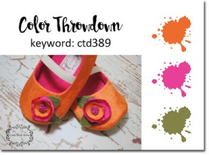 Up first in the line up of today’s card challenges, we have a color challenge from the guru’s of color over at Color Throwdown. This week they are tossing a bright color challenge in the shades of orange, pink and green, and they sure didn’t mean pale when they suggested these colors.

So in the reorganization of my own little space, I made it so the printed paper was easier to access. So I really want this week to dig a little more into the papers. And I knew that there were a couple pieces of watercolored printed card stock that would so very work with this challenge. I pulled out the green and orange colored stock and trimmed it up, liking its sante fe feel. Then I snagged the pink and orange splattered piece and added a Tim Holtz crazy bird to it. I added a bit or extra orange color to our friendly bird with my Akashiya Sai watercolor pen. I added a rose from a Hero Arts and a sentiment from the same stamp pack. Since mother’s day is around the corner, I figured that this little creeper would be a perfect cheer for a mom. Or is that just me?
 The designers over at Freshly Made Sketches this week tossed out a clean and simple sketch with a really interesting design. I don’t know why this one seems so unusual to me, but it really felt different.
I pulled a little mouse stamp from Penny Black and colored it in

with my alcohol markers. I love this stamp pack and probably use it to often, but these little guys always make me smile. I stamped out a mother’s day sentiment from Hero Arts and I added a couple of sheets of printed paper that coordinated with the coloring. But the circle in the back had me stumped. I added a couple of different circle options, and did not like them. I tried white paper, I tried printed paper, I tried cutting out another jar of jam. Nothing. Then I remembered my splatter stamp set from Prima and tried a little ink behind everything. That did work for me. It may not met the design of the sketch, but for me it works.
 The queens of color over at Colour Q tossed out a color challenge this week with a large listing of color. This week they wanted to see black, calypso coral, cool caribbean, gold

and white. Yes that is a large list of colors that don’t normally go together (or at least in my opinion). They do however look awesome together.
I pulled out a stencil and with my ranger blending tool I blended both black soot and abandoned coral Distress Ink through it. Then pulling out the Hero Arts mother day stamp pack I picked the apron image and a sentiment and stamped it out in tumbled glass. I added a bit of gold paint pen to the heart on the apron, and stamped out a happy mom’s day in some Brillance Gold ink.
 Our once a month mixed media card challenge over at The Mixed Media Card Challenge this month tossed out a theme of sunshine and the optional element of bricks. So cool right.

Well, I pulled out some watercolor paper and scored it with my Dr. Ph. Martin’s Hydrus yellow, fading it out with water. Then I splattered it with some orange. I added a sun to the sky and blended a little Distress Ink in wild honey to give a bit of sun rays, and blended a little more fossilized amber around the rest of the sun. Then using Dina Wakley Media elephant paint through a brick stencil (I think it was a Dylusions one). When that dried, I added some white molding paste through the stencil too but not as throughly. I finally sprayed the whole section with Ranger Adirondack sunset orange in a fine mist. Finally after adding two different sentiments from Stampendous, I added two Gorjuss stamp stuffed friends colored in Copics to the wall. I love these little guys, and I love the idea of them growing old together.
 Finally today, we have a sketch challenge from the gals over at The Paper Players. And boy did this sketch have great layers.
So again, the printed paper use up thing, I grabbed a whole

bunch of paper and started cutting it all up into strips and circles. I am ready to be laying out by the pool with little cocktails if you can’t tell by this collection of paper. The stamp from Penny Black doesn’t really go with cocktails and pools, but I think she rocks, and matched up pretty well with the whole idea and colored it with my Copics. The sentiment is from Stampendous (as it seems all of them are if they don’t come from the image’s pack), and I stitched along everything with my white gel pen.
That is it for today, so I am off to paint, and if I don’t make too big a mess, maybe paper craft a little bit more.

Your cards are amazing! You have been busy! I love the mix of patterns and your retro girl! Such a fun card! So happy you liked my sketch! Thanks for joining us at The Paper Players this week! XX
LikeLike
You were one busy girl! Enjoy your new chair! And thanks so much for hooking up with us at the MMCC this month. Your little creatures on the wall are just adorable and that sentiment is perfect.
LikeLike
Wow you have been busy! I love all your cards. Your lettle stuffed toys look perfect on your cleverly executed brick wall and sun background! The sentiment is so heartwarming:) Thanks for joining in the fun at the Mixed Media Card Challenge!
LikeLike
what a great take on the MMCC challenge! really cute card! and btw. really like the Color Q card too :). glad you joined the MMCC challenge this month!
LikeLike
Wow you are quite a productive crafter, and what a fabulous gallery of cards! I love your card for The Paper Players, the image is so femininely retro and works so well with the papers you chose. Thanks for playing along with us this week!
LikeLike
Love this one! Super cute card. Thanks for playing with us this week at The Paper Players.
LikeLike