And if it does, you might fear that all the copic mavens who have thus far given you sage advice will come storm your house and repossess your markers when they find out you're not using smooth bright white paper.
But coloring on non-neutral (white/kraft) cardstock can be really fun, and take your cardmaking to the "next level." It gives you a great base color to start with. But you will have to experiment with your colored CS-- some will bleed terribly and take your ink with it-- to find what you like the best.
Here, I stamped my gladiolas onto lavendar moon CS and shaded the centers. Then I fussy-cut them out. I had ALSO stamped onto spring moss CS, thinking I'd shade the leaves. But when I got to the assembly part I realized that I didn't want to fussy cut a second time, and that a green background was going to look stupid (and that means "stupid when I got done with it" and not "green backgrounds are always stupid"). So I stamped on white, colored in the leaves and tips of the flowers, and adhered my lavendar cutouts.
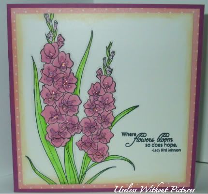
Of course I used stickles. Everything looks better with them. Also, I thought about some gems but couldn't get the placement to look right. Sometimes simple is better, but stickles make the card look a little more special.
Other accessories are PTI as well (sentiment is from flower garden sentiments and I smooshed it a little but I was just darn happy it was straight).
TIP: If you like to use your greys to outline your image, outline it BEFORE you glue the paper cutouts down. Otherwise, you WILL touch your marker to the paper and it WILL suck up the grey ink. Ask me how I know. ;)
8 comments:
Emily, your card is really very beautiful! I love how your coloring (and of course, glittery accents) make this card "special" indeed!
I do love Stickles too! Sometimes it just adds that little extra somethin'- somethin'!! Lovely colouring on the flowers and the colour scheme is very spring like too!
Your coloring often looks like watercoloring...it's got such a peaceful look to it...not sure how else to describe it...since I do not color - LOL But I like....and I love the added sparklies to your flowers too.
Love your take on the challenge, especially the flowers. I simply must give this kind of colouring a 'go' once I buy a few copics. The thought of colouring a whole image from the get-go is a bit overwhelming but some shading seems just a bit more do-able :)
Stickles ROCK!
I really like the sentiment on this card (no, not just the fact you have one, I actually really like the sentiment:)
Too bad you couldn't make the 3x bling work. I always like looking for it.
Thanks for the glue/shade tip. Always helpful to learn from someone else's mistake.
This is a keeper in my book.
Very pretty.
Apologies for the pun in advance, but your Glads make me gald. They are so pretty. Glittery in all their glory. Great tip about the gray. I didn't know that, but am so glad I do now. Awesome!
Beautiful, Emily! Love all the shading and the stickles, too.
Post a Comment