
Welcome to the end of a long week, and the beginning of a long weekend. Yeah for long weekends!! Everyone will be home on Monday and frankly, I am so looking forward to some family time.
I don’t know why, but the end of the school year is so insane. I just feel like I’m running around like a chicken with its head cut off. The good news is I know I am not alone. T-minus 9 days till the kiddos are out of school and the real break begins. (Just so you know, about five days into that break I’ll start the count down till the new school year).
 Up first in our line up of cards today is a great inspiration photo from the designers over at Inspired By All the Little Things. They always have the best photos. This week the colors are what really stood out to me, so that is where I went with my card.

I pulled out a background stamp from Prima and stamped out some Distress Ink peacock feather leaving a cool brick image behind. Then using a Spellbinders die, I cut out a window from both the stamped image, and a clean sheet of card stock. I added some blue curtains under the window to pull out the blue in the door from the image. Yes, it was in fact the wrong shade of darker blue. Oh well I took some Inkadinkadoo vine stamps and added a bit of vines to the wall using a bit of olive Memento INk. Finally adding just a simple little sentiment, I called the card done. I wish I had put some other image under the window, but after I glued down the window, I realized it needed more. There unfortunately was just not way back after the glue was set down.
 This week the sleuths of design over at Can You Case It this week tossed out a color challenge, offering us the colors light purple, yellow and neutrals to work the case.

I pulled out a layering stamp set from Hero Arts and layered shades of yellow and purple Distress Ink to make my little bird. I added the stem and stamped out several shades of purple Distress Ink flowers as well. I know there are lots of people who do not like Distress Ink for layering stamps, especially the clear ones, but I find that if you huff on the stamp right before you stamp it, it give a really nice image. I added some yellow dots (seriously, what do people call this things?… I have not idea what to call the little embellishments, but I like them.) I added a bit of yellow paper under the card and added the focal image to the card with a bit of dimensional tape.
 This time around the gals over at Sunday Stamps through out a really cool color challenge. They had different shades of lime and dark blues, which I actually found really exciting.
Now, since
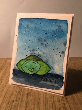
the inspiration photo had a nice little lime image, I decided to used a lime image. I’ve got a cute little set of fruit stamps from Paper Smooches, and I pulled just the lime/lemon gall out. I stamped the main image, and the added a bit of post it tape over it so I could add a few more limes around the main one. I had to add a bit of tape over the face of the lime when I inked up the stamp so the face would only be on the main image. I snagged my Gansai Tambi water colors and watercolored trying to reflect the colors in the challenge. So the limes ended up three different shades of line and I added the darkest blue to the ground and the lighter blue became a gradual shade of blue. I dried the whole image, and added splatters of the darkest blue, plus spatters of white.
 Is week the gals over at the The Paper Players handed out a sketch challenge to get our creative juices flowing. Again, I’ve been trying really had not to take my sketches so literal, so I felt this sketch really was perfect for playing with.

Instead of just using a basic circle, I instead pulled out my super hero stamp pack from Fiskars and stamped out a super hero bubble in the center of my card. I colored it in with my copics in two different shades of yellow and added the sentiment inside the image. Then pulling out little super hero gal from CC Designs, I stamped her out and colored her in again the my copics and added her to the stamp with some dimensional tape. Finally I added a few red, blue and gold sequins and a bit of red under paper. This time I think I fulfilled the sketch, but managed to do it in an unusual way.
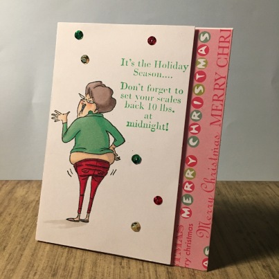
Finally today we have a bit of holiday cheer from the little elves over at Jingle Belles Rock. This time around the elves are calling out for a way to Banish the Holiday Blues. In short, they wanted a holiday card that did not use any blue, but I went one stamp further and wanted to make a card that might just make you giggle. I pulled out a funny little stamp that is a favorite of mine from Art Impressions and stamped her out. I colored her in using my copics, dressing her in some holiday garb (but nothing with blue in it). I then grabbed one of my favorite holiday sentiment cards from Riley & Company Funny Bones and stamped it out in some green ink. I added a few sequins in green, red, and gold. Then snagging a bit of holiday red and green paper, I added it to the side of the card so everyone clearly knew this was my bit of christmas cheer.
That is all for today. I hope you all find great ways to fill your long weekend if you are lucky enough to get one. Take a little time this weekend and do a little coloring. It might just relax you.

Wonderful collection of cards! Love that sweet super hero! So glad you joined us at The Paper Players!
LikeLike
Wow. You’ve been busy. Love your CYCI card. Thanks for playing along this week. Christine
LikeLike
Love all of your awesome one … your Christmas one made me snort a bit … love it … so glad you helped us Banish the Holiday Blues at Jingle Belles.
LikeLike
Really fun watercoloring! I love the depth it creates on your card. Thanks for joining Sunday Stamps this week.
LikeLike
You always amaze me with your wonderful collection of cards each week! Love the little limes and the sentiment! SO happy you joined us at Sunday Stamps this week! XX
LikeLike
oh my gosh, yes, that may be the best holiday sentiment stamp of all time… and a great addition to this fab card! thanks for helping us “banish the holiday blues” (–in both senses0–) at JINGLE BELLES! ♥
LikeLike